Being a company that specializes in designing for various connected devices, we have often learned that limitations are the foundation of the best designs. They are like riddles for us to solve – and we do love riddles!
That’s why we decided to tackle designing for e-ink devices and demonstrate that while limitations can pose a challenge, they don’t have to stand in the way of creating unique, user-friendly designs.
In this article, we’ll cover:
A brief history and background of e-ink technology.
General characteristics of e-ink devices.
The basics of e-ink design.
The limitations and opportunities to consider during the design process.
A study of our example solution: a home screen of an e-ink note-taking device.
Let’s get started!
E-ink devices: the background
Although the e-ink technology was invented around 1997, the first commercial e-ink reader – Sony LIBRIé – didn’t come until 2004 and its availability was restricted to Japan. In 2007 Amazon launched the first Kindle device with massive success as it sold out within 5,5 hours. The rest, as they say, is history.
Nowadays, e-ink devices come in many different flavors and form factors. Some of them are just readers, others come with a stylus and allow handwriting, and there are also those that have color displays. The technology has also been used in mobile phones (e.g., HiSense A9 or Mudita Pure) and smartwatches (e.g., the intriguing Sony Fes Watch U).
General characteristics
No matter the kind of device and its shape, e-ink screens share some common characteristics – and limitations.
The biggest of them is, of course, the low refresh rate. Other limitations to be mindful of include limited greyscale, and pale colors (if available at all). Also, a common pitfall to watch out for is poor hardware specification (resulting in choppy performance).
But it’s not all bad. On the positive side, e-ink devices offer superb power efficiency and have the advantage of permanently displaying content without screen burn-in and battery drain. They also aren’t as eye-straining compared to regular screens.
In addition, a device that’s dedicated to a specific problem you want to solve and one you will be spending hours with is a much better fit than a universal all-in-one device with all the distractions, notifications, etc. built in.
The basics of designing for e-ink devices
When designing for e-ink devices, it’s important to remember that they are not and never will be universal all-in-one devices like, for example, the iPad. They are not for everyone and anyone. This means that you need to consider your target audience and design with their specific needs in mind so that you give users the most value.
A specific user group like that can often (but not always, as proven by Kindle) consist mainly of power users and tech enthusiasts. For this reason, it’s crucial to start with extensive research – learning about the target audience’s jobs-to-be-done, pains, and gains.
Don’t be afraid to introduce advanced features. In this case, it’s better to go too deep rather than too shallow, which means digging for additional insights and blockers – like business people having trouble connecting to captive networks in hotels (looking at you, reMarkable), or not being able to remotely wipe their devices to protect information.
Crucial limitations
An important thing to remember is that most of e-ink products are a little too limited to function as standalone, independent devices.
It’s kind of a self-fulfilling prophecy; the specifics of e-ink devices make them especially strong in some use cases so they are built for those purposes, while other capabilities suffer.
In other words, universal, standalone e-ink devices aren’t being made, because they wouldn’t be as good as regular touchscreen devices. Because of that, in order to be a really useful and efficient tool for power users, the devices require an entire ecosystem of digital solutions supporting them.
That means extra work because you need to:
design and build companion apps (desktop, mobile, and/or web), browser plugins, cloud sync solutions, etc.
you need them available on multiple OSes, browsers, etc. (unless you’re Apple).
Of course, the scope of work and the features needed depend on the type of device.
Due to these e-ink limitations, a lot of tasks (like typing on the on-screen keyboard) are more tedious than they should be, so it’s best to offload those tasks to devices that are better suited to complete them.
Regarding the ecosystem, it’s also crucial to remember about proper, two-way communication. Sending files to or from the device should be easy and support multiple formats. Fast and (ideally) automatic progress syncing is also a must-have.
Interface & interaction design
Now that we’ve gone through the specifics of e-ink technology, it’s time to take a look at the design process itself.
Once the groundwork has been laid properly, we can begin to design the actual interface and interactions. Without further ado, here are some insights we have discovered regarding designing for e-ink devices.
Explore the opportunities

Focus on the purpose. Since e-inks are not all-in-one devices, avoid feature creep. Don’t add non-essential features. Instead, make sure that whatever your device does, it does exceptionally well.
No distractions – don’t implement notifications and other alerts. Make it possible for the user to focus on whatever they are doing with your device without interruptions. The fact there are no notifications could be the reason the user decided to use the device in the first place.
Immersion – it’s a black & white interface, so keep it simple. The old saying “best interface is no interface” is not entirely true, but a minimalistic interface will allow your users to immerse themselves in the experience with your device.
Utilize the lock screen. E-ink can display something almost indefinitely without consuming battery and causing screen burn-in. This means you can utilize the lock screen in ways that no other touchscreen device allows for – embrace it, explore it! There’s always something you can do to enhance your users’ experience with your device.
Consider the limits

Design the interface like a comic book. Use static, separate pages; think about proper information architecture, navigation, and user flows to facilitate that.
Don’t use fluid scrolling. It doesn’t look good on an e-ink screen; rely on other means, like pagination or sequential scrolling (e.g., one row/column/page at a time).
Avoid situations in which the interface might need to rescale. For example, too long filenames, overlapping elements (like Material Design Floating Action Buttons), etc. Remember, no scrolling means elements must not be obscured by anything or be drawn outside of the viewport!
Avoid rapid changes on the screen. For example, suggestions in a live search feature or slide-out menus – these all look bad on low refresh rate screens.
Don’t use animations and micro-interactions. A gradually incrementing progress bar (think Windows 95) is fine, but a constantly spinning wheel is not.
Avoid layered, 3D-like interfaces, drop-shadows, etc. Due to e-ink screens having relatively limited grayscale capabilities, the shadows won’t look great.
Don’t use drag & drop and similar interactions. They rely on precision and exact visual information on where the dragged objects currently are, which is not possible to achieve with e-ink’s low refresh rate. Pinching to zoom in or out (for example, to change font size) is okay, though.
Make sure that using the device’s on-screen keyboard is as limited as possible. Typing on e-ink devices is usually not a pleasant experience – partially due to the screen refresh rate, partially because of worse touch sensitivity, and partially because of slow hardware. It’s best to offload typing elsewhere, and/or use no-keyboard solutions.
Choose the right font. Avoid thin, serif fonts. Go with thicker, sans-serif ones instead.
Use vector graphics and high-quality images. Vector graphics are more scalable and easier to display on e-inks than raster images.
Keep the user interface simple. E-ink devices don’t usually come with top-notch hardware. If the interface is too complicated and overloaded, the device might become sluggish because of performance issues.
Additional tips

Check your work on an e-ink display. E-ink displays have their specifics, so it's important to test your ideas on an actual e-ink device to verify if they work as intended.
Verify your ideas with the target audience. Obviously, this tip is not specific to e-ink devices, but due to their specifics, they have different use cases, and their users have different habits compared to regular touchscreen devices, so it’s especially important to validate your design decisions.
Remember about digital accessibility. Make sure your designs and the device itself can be conveniently used by people with various disabilities. There are multiple resources available on how to ensure compatibility with ADA, WCAG, and the European Accessibility Act. Use them!
Our solution: Home screen of an e-ink note-taking device
To give you an example of a thought-out design for e-ink, we have tackled a specialized, power-user-focused device for reading and note-taking – something for business people often on the move, needing to quickly work on their ideas in different environments, and share their work with clients and employees.
We started with benchmarking to see what’s currently on the market. Between reMarkable 2, Kindle Scribe, Onyx Boox, and Kobo readers, we found a lot of inspiration. To deepen our knowledge, we’ve also analyzed some of the best iPad note-taking apps (Apple Notes, GoodNotes, Nebo, and NoteShelf).
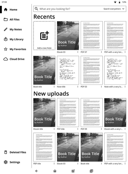
Then, we applied our learnings to create our own approach to the subject. Below, you'll find a mockup of what we’ve come up with and a summary of our design decisions:
Home screen & navigation
With the home screen, we wanted to provide the user with immediate access to the latest files – both the ones they were recently working with, and the ones only just uploaded to the device. Of course, a search bar is also available, with a quick filter allowing for limiting the search to file names, authors, and contents.
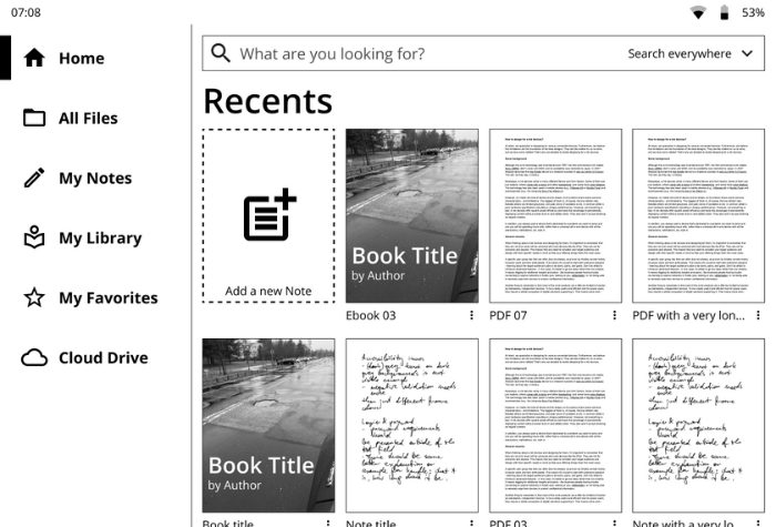
The left side of the screen is occupied by a persistent navigation bar. It allows for quickly switching between different views – a file manager, flat views of notes, documents (anything uploaded, be it a PDF, an ebook, or other file types), and favorites.
One can also quickly access connected cloud drives, like Google Drive or Dropbox. Finally, links to the Trash folder and device settings are also available.
Buttons
As you can see, we’ve decided to implement the old-school-Android-like bottom navigation, with persistent Back, Home, New note, and Recents buttons.
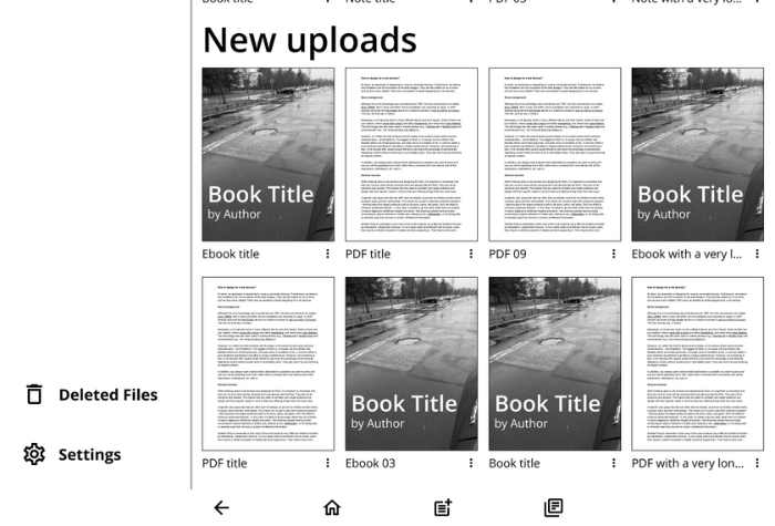
It doesn’t use much screen estate while providing the user with a very fast way of navigating the device.
In addition to the standard 3 buttons, we’ve also added a New note button, allowing the user to quickly create a new note wherever they are. To improve discoverability, we’ve also used the same icon, but larger, on the home screen.
Also, there’s a twist: the Recents button only works for the last four recently used files. Once tapped, the user can quickly switch between them – for example to copy something or quickly check for a reference.
On most e-ink devices switching between files requires exiting the current one, going back to the home screen, finding the other one, opening it, and then repeating the procedure to go back to the previous file. Our idea reduces this ordeal to just two taps!
Closing words
Learning about e-ink specifics, figuring out its secrets, and designing a home screen for such a device proved to be a fun, educational, and challenging activity. If you’re mindful of both the opportunities and limitations of these devices, you’ll be able to create a design that’s practical and pleasant to use for your customers.
If you’re developing an e-ink device and want to benefit from our knowledge and skills, don’t hesitate to contact us!

Piotr Schmidtke
UX Expert


